Snack Attack
Snack Attack
Snack Attack
NEW PRODUCT
NEW PRODUCT
WEB APP
WEB APP
UX
PRODUCT DESIGN
HEALTH & WELLNESS
UI
E-COMMERCE
E-COMMERCE
UX
UI
PRODUCT DESIGN
HEALTH & WELLNESS
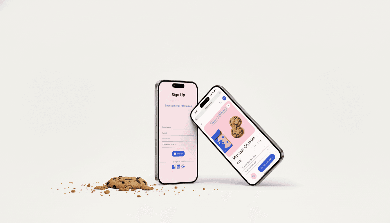
A concept e-commerce platform that empowers health-conscious online shoppers to make informed and sustainable snack choices through an intuitive, gamified experience.
A concept e-commerce platform that empowers health-conscious online shoppers to make informed and sustainable snack choices through an intuitive, gamified experience.
Overview
Overview
CHALLENGE
CHALLENGE
Today’s health-conscious consumers face an overwhelming snack market: full of choices, but low on clarity. Many e-commerce stores feel sterile or transactional, making healthy shopping a chore. The challenge: design an engaging, intuitive platform where users can discover nutritious snacks while feeling rewarded for their sustainable habits.
Today’s health-conscious consumers face an overwhelming snack market: full of choices, but low on clarity. Many e-commerce stores feel sterile or transactional, making healthy shopping a chore. The challenge: design an engaging, intuitive platform where users can discover nutritious snacks while feeling rewarded for their sustainable habits.
SCOPE
SCOPE
Concept design developed during a three-week design sprint at SPICED Academy.
Role: End-to-end Product Designer (UX/UI & Visual Identity)
Duration: 3 Weeks
Focus: UI Design, Prototyping, Usability Testing
KEY RESULTS
KEY RESULTS
100% success rate: every task successfully completed during Maze tests
70% Usability score: positive feedback on clarity and ease of navigation
Process
Process
APPROACH
APPROACH
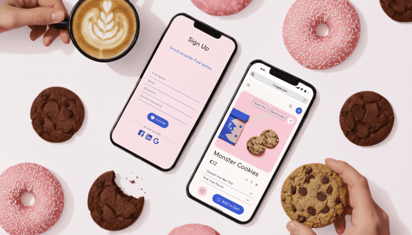
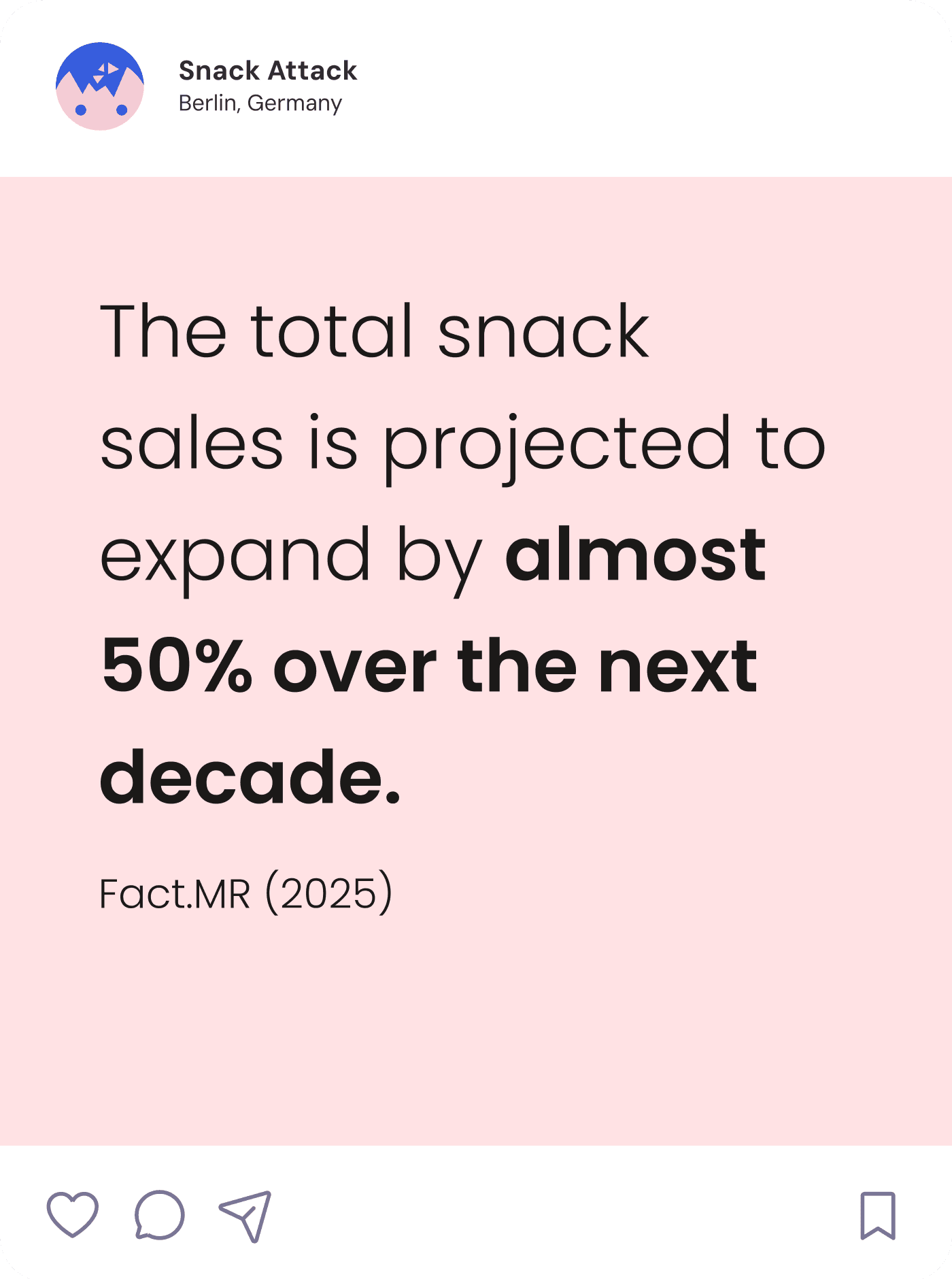
I wanted to create an experience that felt both energetic and kind — a balance between playfulness and usability. From the start, I approached Snack Attack as a product that could motivate users to make better choices without judgment. The concept blends gamification with soft visual cues to make “healthy” feel exciting rather than restrictive.
I wanted to create an experience that felt both energetic and kind — a balance between playfulness and usability. From the start, I approached Snack Attack as a product that could motivate users to make better choices without judgment. The concept blends gamification with soft visual cues to make “healthy” feel exciting rather than restrictive.
01
Defining User needs & wants
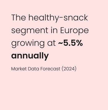
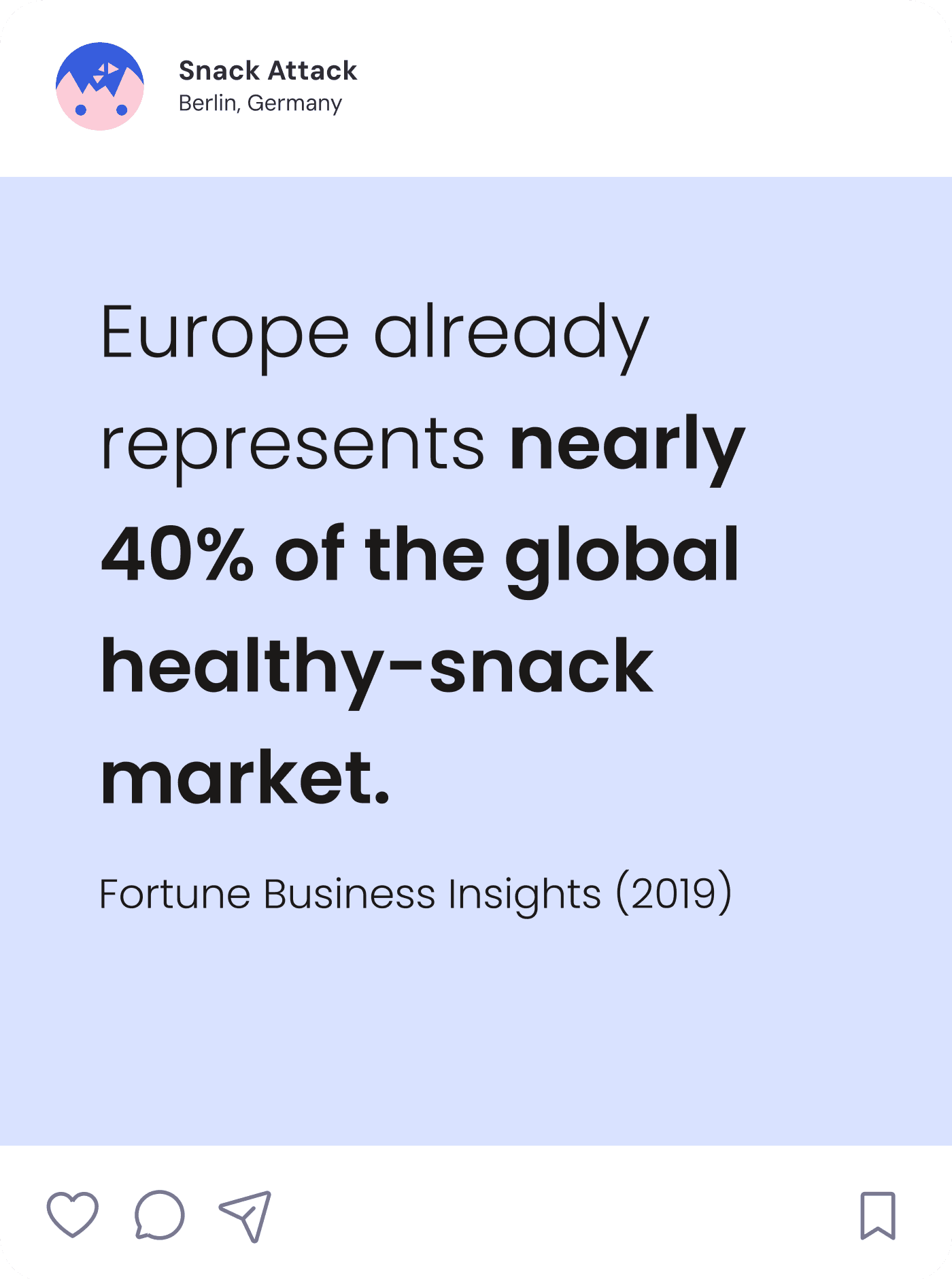
To understand what motivates users when shopping for healthy snacks, I explored common behaviors in health and wellness e-commerce. Three main needs stood out: clarity, motivation, and accessibility.
To understand what motivates users when shopping for healthy snacks, I explored common behaviors in health and wellness e-commerce. Three main needs stood out: clarity, motivation, and accessibility.
INFORMED DECISIONS
Help users make confident, goal-aligned choices by showing nutritional and sustainability info clearly.
Help users make confident, goal-aligned choices by showing nutritional and sustainability info clearly.
INTERACTION & ENGAGEMENT
Motivate users with playful gamification and community rewards that celebrate healthy habits.
Motivate users with playful gamification and community rewards that celebrate healthy habits.
ACCESSIBILTY & INTUITIVITY
Make healthy shopping effortless for everyone through clear navigation and simple filtering.
Make healthy shopping effortless for everyone through clear navigation and simple filtering.
INFORMED DECISIONS
Help users make confident, goal-aligned choices by showing nutritional and sustainability info clearly.
INTERACTION & ENGAGEMENT
Motivate users with playful gamification and community rewards that celebrate healthy habits.
ACCESSIBILTY & INTUITIVITY
Make healthy shopping effortless for everyone through clear navigation and simple filtering.
02
Defining the Design Principles
To ensure coherence across all design stages, I established three guiding principles. They defined how the product should look, feel, and behave — translating user needs into tangible design criteria.
To ensure coherence across all design stages, I established three guiding principles. They defined how the product should look, feel, and behave — translating user needs into tangible design criteria.
PLAYFUL
CLARITY
I used bright colors and rounded shapes to communicate energy and friendliness without overwhelming usability.
I used bright colors and rounded shapes to communicate energy and friendliness without overwhelming usability.
EMPATHY
FIRST
I tested microinteractions with users to ensure delight didn’t come at the cost of accessibility or focus.
I tested microinteractions with users to ensure delight didn’t come at the cost of accessibility or focus.
INCLUSIVE BY DESIGN
Contrast, typography size, and color pairing were chosen to ensure legibility for users with visual sensitivities.
Contrast, typography size, and color pairing were chosen to ensure legibility for users with visual sensitivities.
03
Coming up with a Product
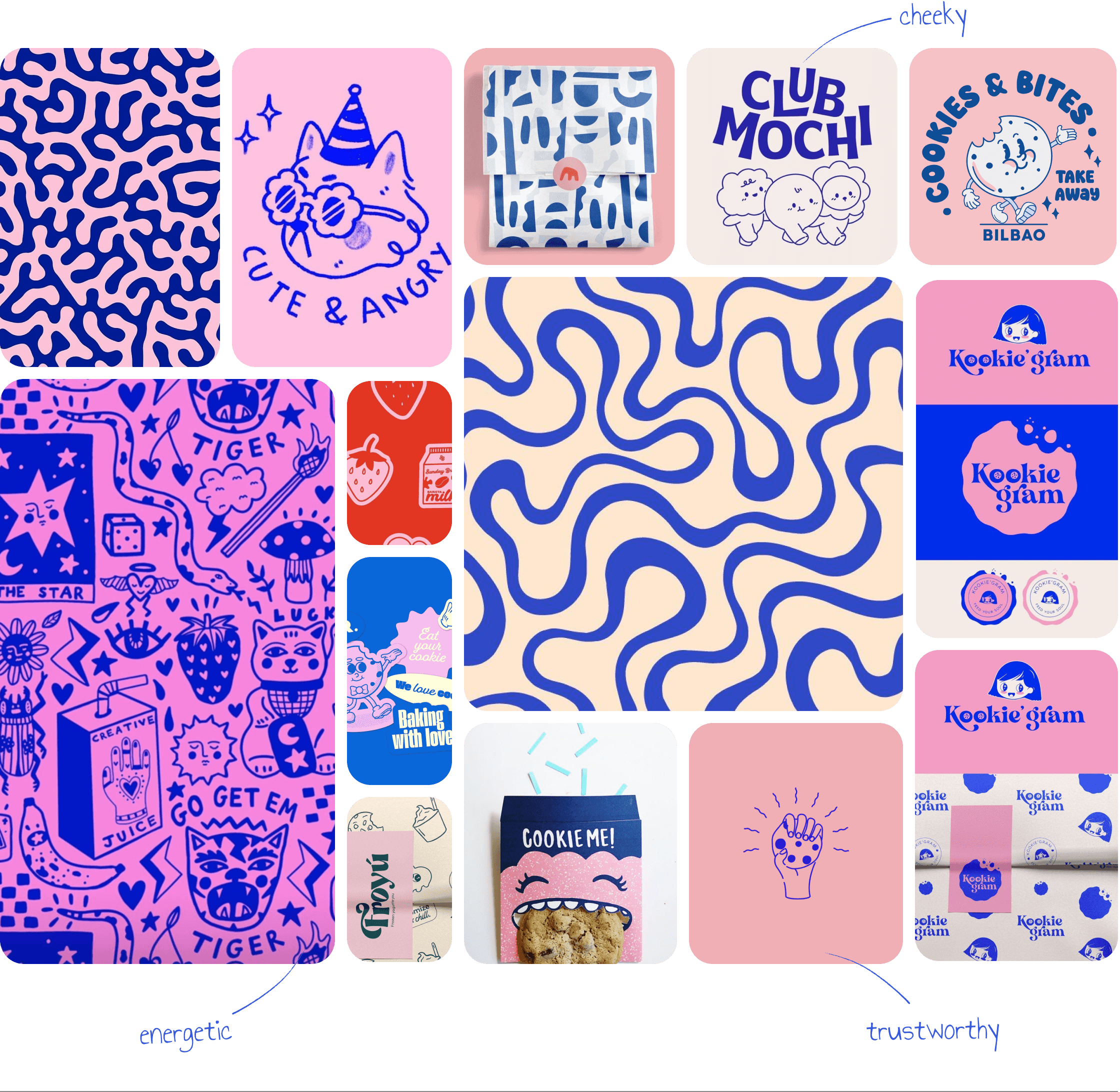
Before sketching layouts, I built a moodboard to define the product's emotional tone.
Before sketching layouts, I built a moodboard to define the product's emotional tone.
04
Defining the Visual Language
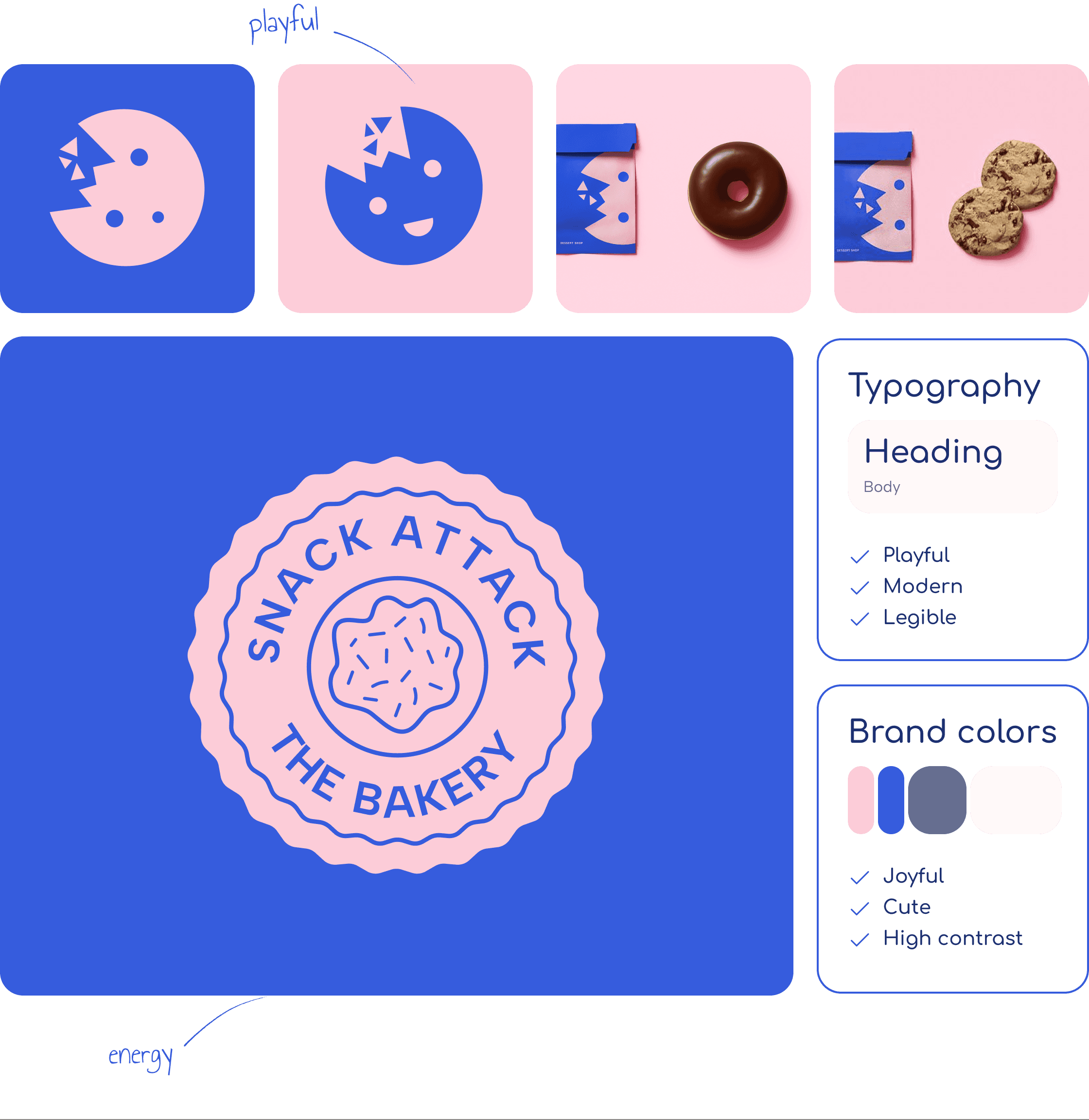
Because bright colors can quickly become overwhelming, I paired the bold pinks and blues with warm neutrals to improve readability.
Because bright colors can quickly become overwhelming, I paired the bold pinks and blues with warm neutrals to improve readability.
05
User Flow & Wireframing
Early wireframes focused on reducing friction in the browsing flow and creating moments of engagement beyond the purchase itself.
Early wireframes focused on reducing friction in the browsing flow and creating moments of engagement beyond the purchase itself.
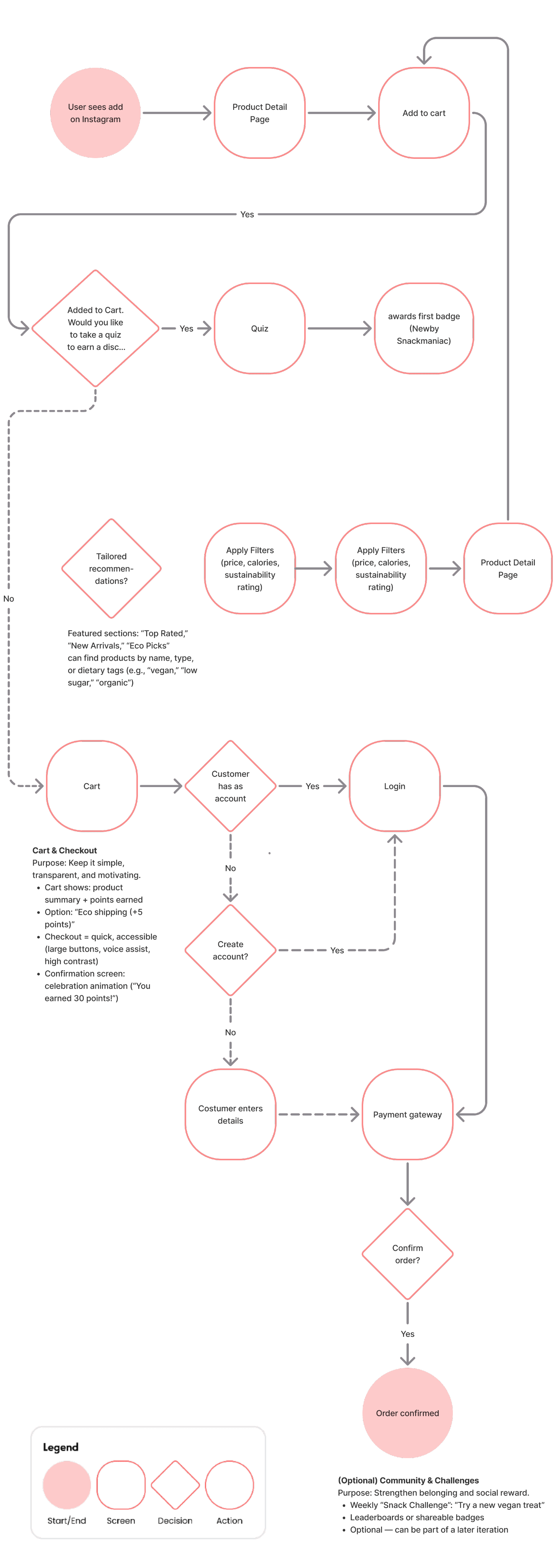
USER FLOW - V2
USER FLOW - V2
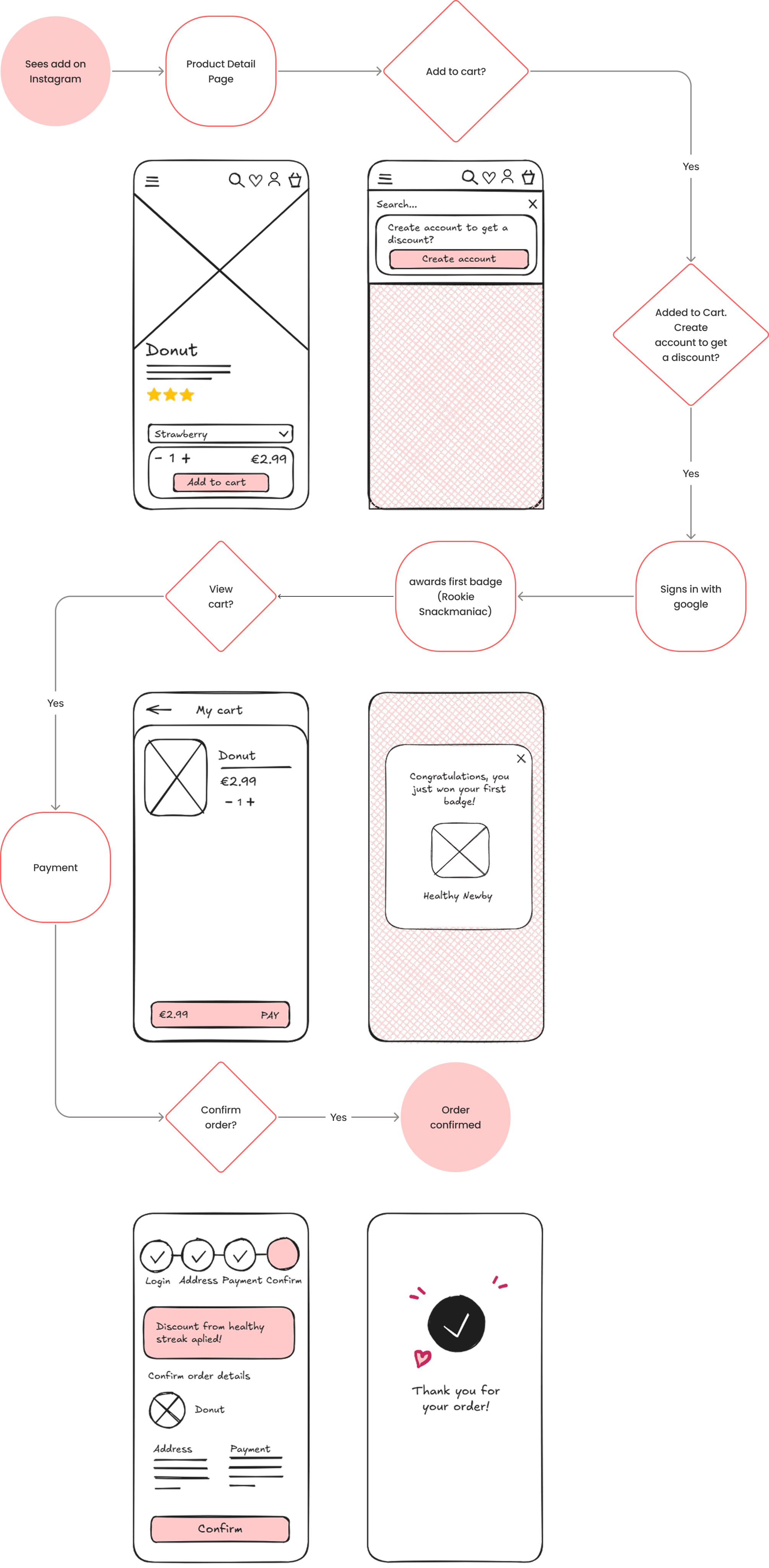
Based on user feedback and competitive analysis, I pivoted to a more streamlined approach: offering users an exclusive community discount in exchange for account creation or newsletter sign-up. This aligned with familiar e-commerce patterns, reduced friction in the browsing flow, and kept engagement optional rather than mandatory. By moving the incentive closer to checkout, I maintained a simple, intuitive journey while still encouraging loyalty and long-term user retention.
USER FLOW - V1
In the first version of the user flow, I introduced a short onboarding quiz to personalize the experience, helping users find snacks based on their dietary goals while rewarding them with a “Newbie” badge and 15% discount.
However, after analyzing similar e-commerce platforms, I noticed that most follow a simpler and more familiar pattern: offering a discount in exchange for newsletter sign-up or account creation closer to checkout.
To reduce friction and align with user expectations, I pivoted to this model, shortening the flow while still supporting engagement and enabling future marketing through user data collection.
06
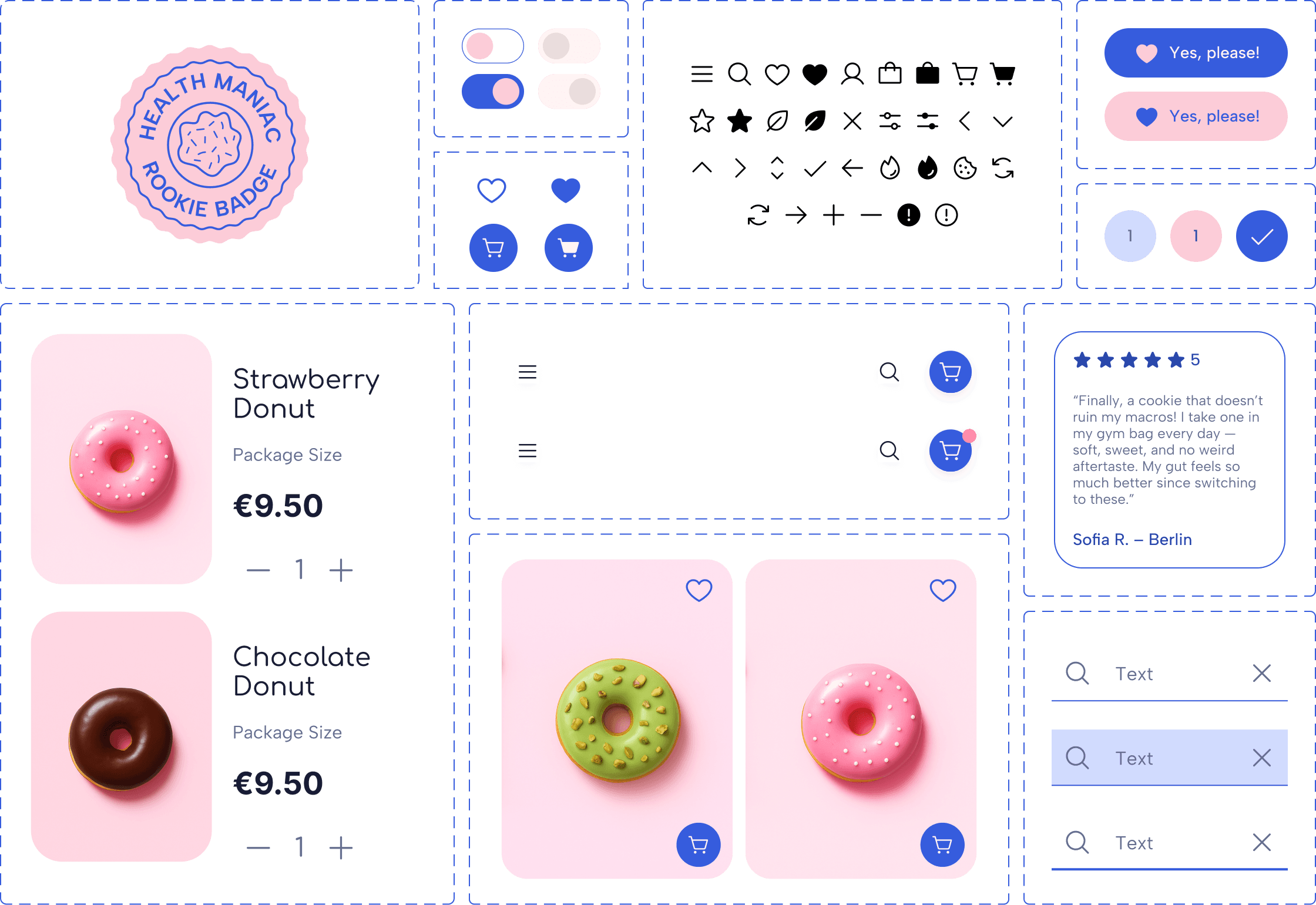
Building the Component Library
Buttons, input fields, and badges all followed the same logic of rounded geometry and high contrast to keep the interface approachable and accessible.
Buttons, input fields, and badges all followed the same logic of rounded geometry and high contrast to keep the interface approachable and accessible.
07
Conducting Usability Testing
My goal was to validate whether the design felt as intuitive as it looked, and to identify where playfulness might be distracting rather than helping.
My goal was to validate whether the design felt as intuitive as it looked, and to identify where playfulness might be distracting rather than helping.
PRODUCT DETAILS
Assess clarity of product information
PURCHASE FLOW
Evaluate ease of use in the purchase flow
COMMUNITY FEATURES
Test value of community features
OVERALL FLOW
Identify pain points and opportunities
Strong flow clarity
Gamified elements went unnoticed
08
Analysis
The Maze data confirmed the design’s overall usability (100% success rate, 70% usability score), but also revealed missed opportunities.
INSTAGRAM ADD
Ineffective marketing on Instagram. Not clear enough. Add more info.
Ineffective marketing on Instagram. Not clear enough. Add more info.
ROOKIE DISCOUNT
Overlooked discount. Value add not clear. Add more info.
Overlooked discount. Value add not clear. Add more info.
DELIVERY DETAILS
Unclear delivery options
Unclear delivery options
PRODUCT VARIETY
Add more products (chocolate & chips)
Add more products (chocolate & chips)
09
Iterations
Using a prioritization matrix, I focused on high-impact, low-effort improvements, especially around information clarity and visibility.
Using a prioritization matrix, I focused on high-impact, low-effort improvements, especially around information clarity and visibility.
INSTAGRAM ADD
INSTAGRAM ADD
ROOKIE DISCOUNT
ROOKIE DISCOUNT
DELIVERY DETAILS
DELIVERY DETAILS
PRODUCT VARIETY
PRODUCT VARIETY
Cleaner, more intuitive and enjoyable user journey
10
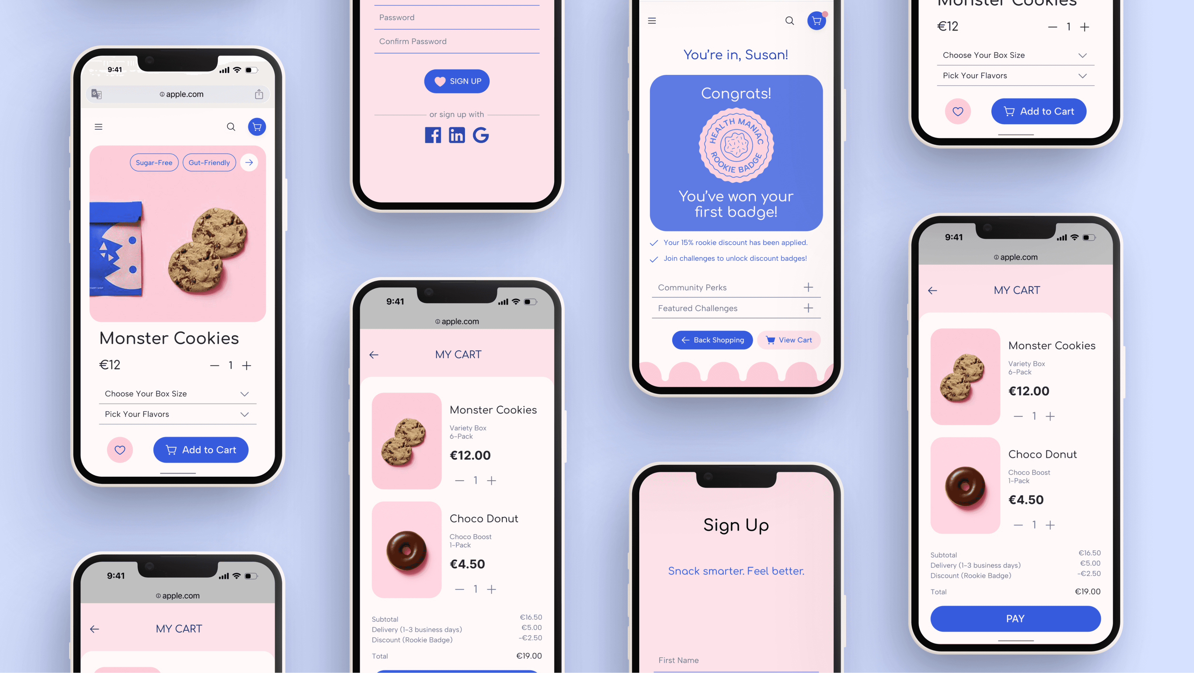
Prototype
Impact & Reflection
Impact & Reflection
HOW I SOLVED THE PROBLEM
HOW I SOLVED THE PROBLEM
By combining emotional design with functional clarity, I created an e-commerce experience that encourages users to engage with healthy products rather than scroll past them.
By combining emotional design with functional clarity, I created an e-commerce experience that encourages users to engage with healthy products rather than scroll past them.
HOW THE USER WAS AFFECTED
HOW THE USER WAS AFFECTED
Users described the platform as “fun,” “easy,” and “motivating.” The Maze tests confirmed strong usability and showed that small moments of delight can boost perceived ease of use.
Users described the platform as “fun,” “easy,” and “motivating.” The Maze tests confirmed strong usability and showed that small moments of delight can boost perceived ease of use.
SELF REFLECTION
This project taught me that playfulness and clarity must coexist carefully: joy can amplify usability when guided by empathy.
This project taught me that playfulness and clarity must coexist carefully: joy can amplify usability when guided by empathy.
If I had more time, I would expand user testing to explore accessibility features and the long-term effects of gamification on motivation.
If I had more time, I would expand user testing to explore accessibility features and the long-term effects of gamification on motivation.