SOLO
DESIGN SYSTEM
BRAND IDENTITY
ARCHITECTURE & INTERIORS
BRAND STRATEGY
UX
SOLO
DESIGN SYSTEM
BRAND IDENTITY
ARCHITECTURE & INTERIORS
BRAND STRATEGY
UX
UI
A modular brand system that balances architectural rigor with human scale and regional identity.
A modular brand system that balances architectural rigor with human scale and regional identity.
Overview
Overview
CHALLENGE
CHALLENGE
SOLO Architecture & Design was born from the encounter between people, disciplines, and territory. The name SOLO carries a double meaning: it is the soil as the place where architecture happens, where the work is anchored in the climate, landscape, and local culture; and it is also the meeting between two complementary disciplines, design (Souza) and architecture (Lopes).
The challenge was to create a visual identity that could express confidence through human warmth and precision. The brand needed to avoid generic architecture aesthetics while remaining precise, durable, and scalable.
The challenge: design a visual system that balances structure and sensitivity, supporting both architectural documentation and expressive brand moments.
SOLO Architecture & Design was born from the encounter between people, disciplines, and territory. The name SOLO carries a double meaning: it is the soil as the place where architecture happens, where the work is anchored in the climate, landscape, and local culture; and it is also the meeting between two complementary disciplines, design (Souza) and architecture (Lopes).
The challenge was to create a visual identity that could express confidence through human warmth and precision. The brand needed to avoid generic architecture aesthetics while remaining precise, durable, and scalable.
The challenge: design a visual system that balances structure and sensitivity, supporting both architectural documentation and expressive brand moments.
SCOPE
SCOPE
Brand identity system designed to support institutional, technical, print, and digital applications.
Role: Brand Strategist & Visual Designer
Duration: 4 weeks
Focus: Brand Strategy, Visual Identity, Design System
Team: Susan Suzart (solo project, in collaboration with the client)
KEY RESULTS
KEY RESULTS
Clear and consistent brand recognition across technical and expressive contexts.
Strong alignment between architecture and design disciplines
A scalable system supporting long-term studio growth
Process
Process
APPROACH
APPROACH
APPROACH
The identity was approached as a system, not a collection of visual assets.
Rather than prioritizing expression, the process focused on clarity, rules, and modularity, allowing the brand to adapt across contexts while remaining coherent.
The goal was to design an identity that behaves like architecture itself: structured, contextual, and human-scaled.
The identity was approached as a system, not a collection of visual assets.
Rather than prioritizing expression, the process focused on clarity, rules, and modularity, allowing the brand to adapt across contexts while remaining coherent.
The goal was to design an identity that behaves like architecture itself: structured, contextual, and human-scaled.
01
First, the context
To ground the system in real practice, the process started with understanding SOLO’s positioning, values, and daily use cases, from technical documentation to client-facing communication. Two insights shaped the direction:
To ground the system in real practice, the process started with understanding SOLO’s positioning, values, and daily use cases, from technical documentation to client-facing communication. Two insights shaped the direction:
Client trust is built through clarity and consistency - especially in technical and institutional environments.
Client trust is built through clarity and consistency - especially in technical and institutional environments.
The human scale emerges through proportion, rhythm and restraint - not decoration.
The human scale emerges through proportion, rhythm and restraint - not decoration.
02
Our Goals
Based on these insights, three core goals guided every design decision.
Based on these insights, three core goals guided every design decision.
STRUCTURE
Support technical and institutional communication with clarity and rigor
Support technical and institutional communication with clarity and rigor
CONTEXT
Reflect materiality, territory and local identity without visual clichés
Reflect materiality, territory and local identity without visual clichés
HUMAN SCALE
Maintain warmth, proximity and authorship within a precise system
Maintain warmth, proximity and authorship within a precise system
03
Define Brand Strategy
The brand strategy outlines the positioning and core principles that informed every design decision.
The brand strategy outlines the positioning and core principles that informed every design decision.
Why we exist
To create architecture and interiors that make sense within their context — spatially, culturally, and humanly.
How We Work
We are guided by dialogue and responsibility. We collaborate and guide, rather than impose.
Our Clients
They seek more than functional solutions. They value quality, authorship, and close collaboration.
What we believe in
We believe in contextual architecture. All solutions are designed to respect time, place, and people.
What Sets Us Apart
The integration of two disciplines in a coherent flow: architecture & interior design
Where We’re Going
To grow consistently by strengthening long-term relationships of trust, and expanding without losing our core values.
Why we exist
To create architecture and interiors that make sense within their context — spatially, culturally, and humanly.
How We Work
We are guided by dialogue and responsibility. We collaborate and guide, rather than impose.
Our Clients
They seek more than functional solutions. They value quality, authorship, and close collaboration.
What we believe in
We believe in contextual architecture. All solutions are designed to respect time, place, and people.
What Sets Us Apart
The integration of two disciplines in a coherent flow: architecture & interior design
Where We’re Going
To grow consistently by strengthening long-term relationships of trust, and expanding without losing our core values.
04
The Color System
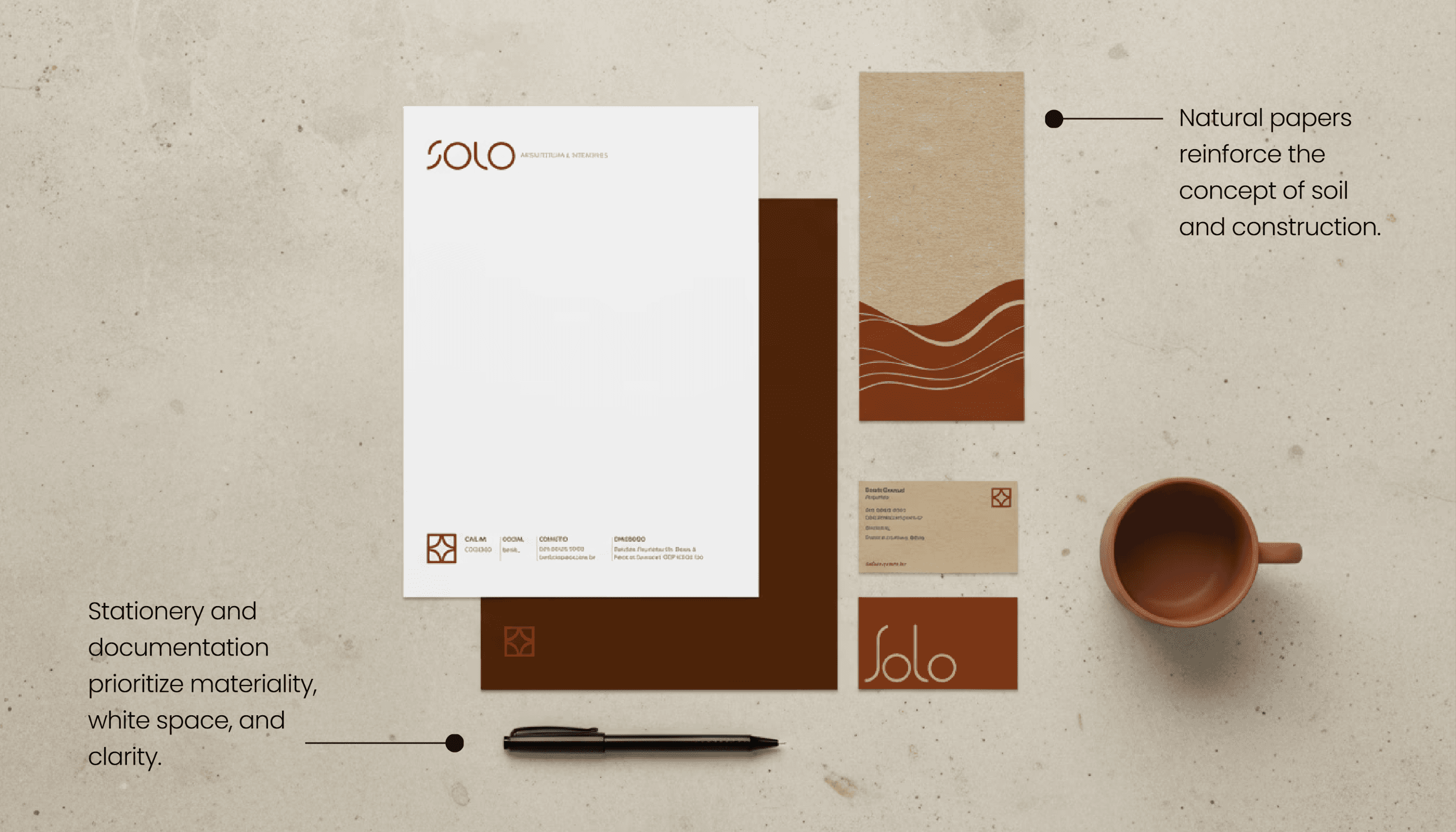
Earthy, material-driven colors inspired by clay, vegetation, and Brazilian landscapes. Tested combinations ensure contrast and legibility across print and digital.
BriCK RED
Primary function: emphasis and identity. Evokes clay, terracotta, and sun-exposed soil. Introduces warmth and personality.
Primary function: emphasis and identity. Evokes clay, terracotta, and sun-exposed soil. Introduces warmth and personality.
CANE GREEN
Secondary function: balance and stability. It refers to vegetation, landscape, and permanence. It softens the orange and adds seriousness.
Secondary function: balance and stability. It refers to vegetation, landscape, and permanence. It softens the orange and adds seriousness.
COFFEE BLACK
Function: text and lines. Functional base. Softer and more material than pure black, it maintains visual warmth.
Function: text and lines. Functional base. Softer and more material than pure black, it maintains visual warmth.
SAND WHITE
Function: contrast and breathing room. Clean, quiet and functional, it enhances readability and reduces eye strain.
Function: contrast and breathing room. Clean, quiet and functional, it enhances readability and reduces eye strain.
05
The Typo
Typography was selected to support clarity in technical contexts while maintaining a human tone.
Typography was selected to support clarity in technical contexts while maintaining a human tone.
Primary
Structural, clear
Contemporary
Outfit
Aa Bb Cb Dd Ee Ff Gg Hh Ii Jj Kk Ll Mm Nn Oo Pp Qq Rr Ss Tt Uu Vv Ww Xx Yy Zz
0 1 2 3 4 5 6 7 8 9
Outfit
Aa Bb Cb Dd Ee Ff Gg Hh Ii Jj Kk Ll Mm Nn Oo Pp Qq Rr Ss Tt Uu Vv Ww Xx Yy Zz
0 1 2 3 4 5 6 7 8 9
Secondary
Warm, readable
Narrative
Lora
Aa Bb Cb Dd Ee Ff Gg Hh Ii Jj Kk Ll Mm Nn Oo Pp Qq Rr Ss Tt Uu Vv Ww Xx Yy Zz
0 1 2 3 4 5 6 7 8 9
Lora
Aa Bb Cb Dd Ee Ff Gg Hh Ii Jj Kk Ll Mm Nn Oo Pp Qq Rr Ss Tt Uu Vv Ww Xx Yy Zz
0 1 2 3 4 5 6 7 8 9
Primary
Structural, clear
Contemporary
Outfit
Aa Bb Cb Dd Ee Ff Gg Hh Ii Jj Kk Ll Mm Nn Oo Pp Qq Rr Ss Tt Uu Vv Ww Xx Yy Zz
0 1 2 3 4 5 6 7 8 9
Secondary
Warm, readable
Narrative
Lora
Aa Bb Cb Dd Ee Ff Gg Hh Ii Jj Kk Ll Mm Nn Oo Pp Qq Rr Ss Tt Uu Vv Ww Xx Yy Zz
0 1 2 3 4 5 6 7 8 9
06
The graphic language
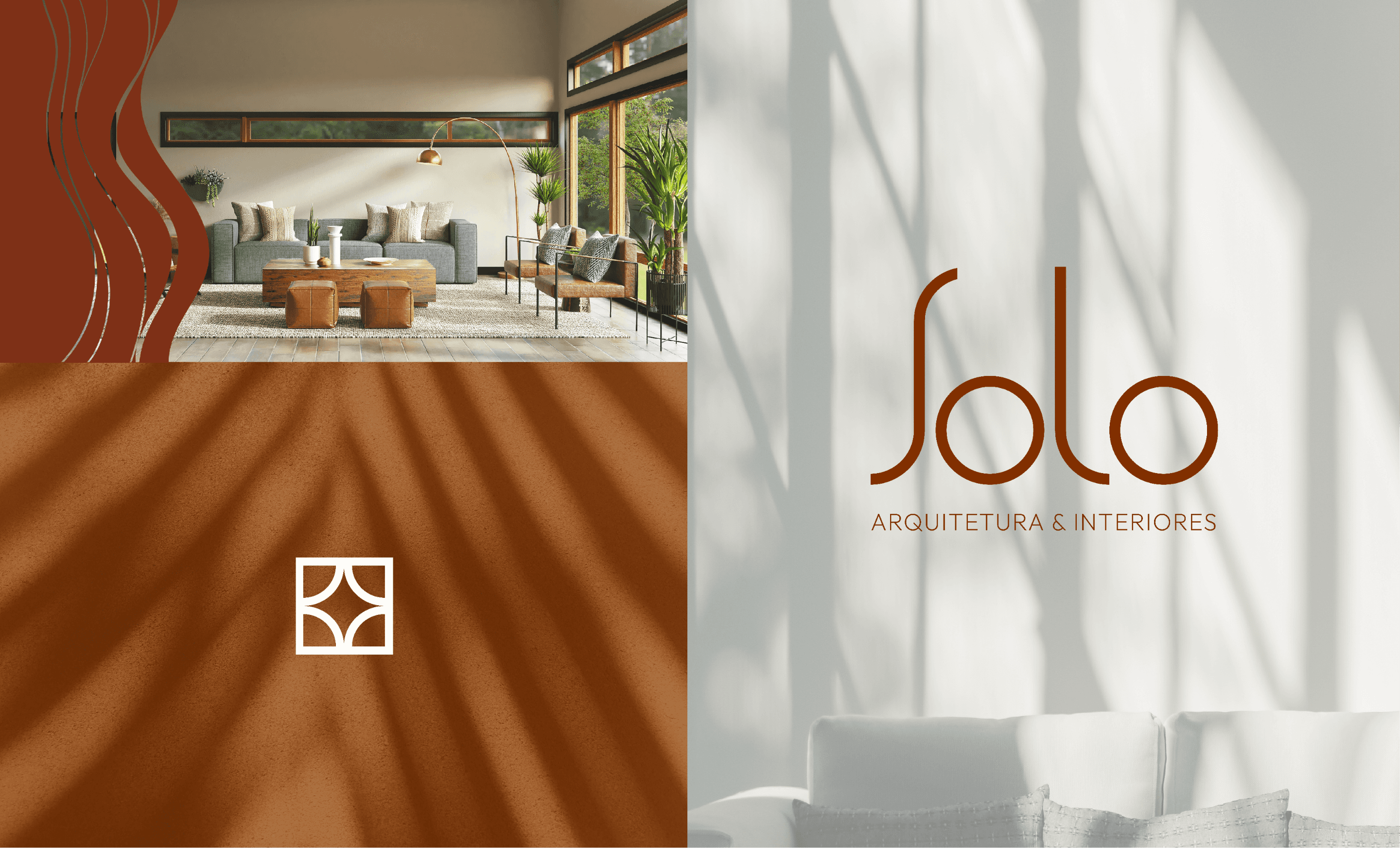
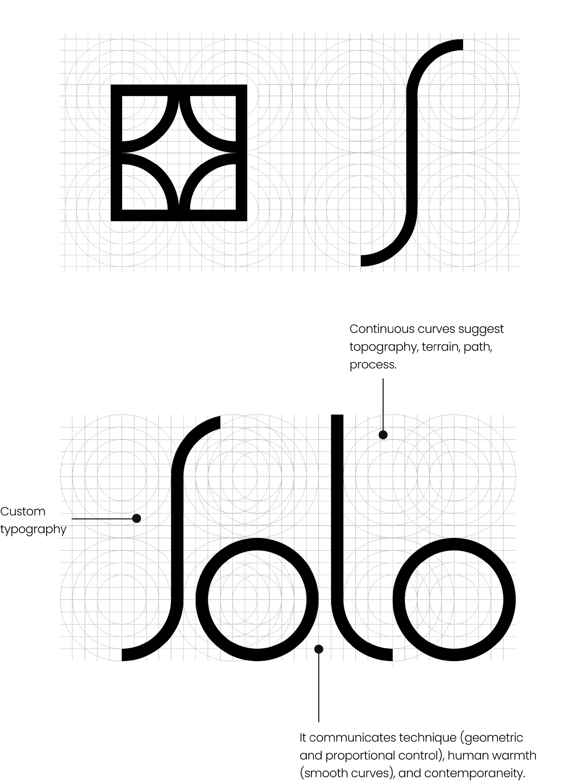
In the symbol, curves, consistent stroke weights, and modular repetition. In the pattern, a reference to terrain, process, and construction logic.
In the symbol, curves, consistent stroke weights, and modular repetition. In the pattern, a reference to terrain, process, and construction logic.
Pattern
Derived from organic lines alluding to the topography
Follows a modular and repeatable logic, allowing for controlled variations in scale, density, and contrast.

Symbol
Inspired by the Brazilian cobogó (a type of perforated brick)
Supporting and expressive element of the visual system

Pattern
Derived from organic lines alluding to the topography
Follows a modular and repeatable logic, allowing for controlled variations in scale, density, and contrast.
07
Building the Design System
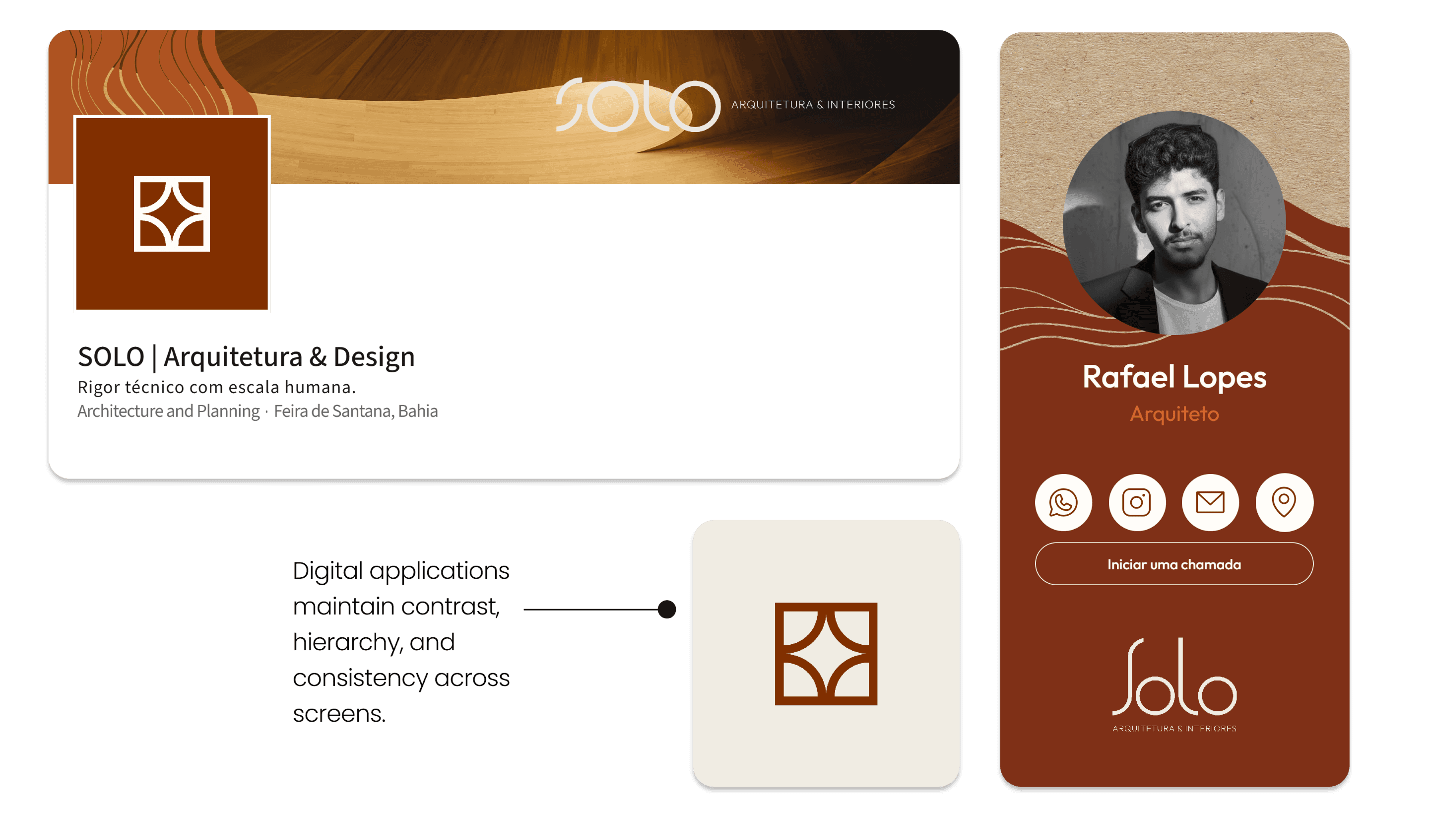
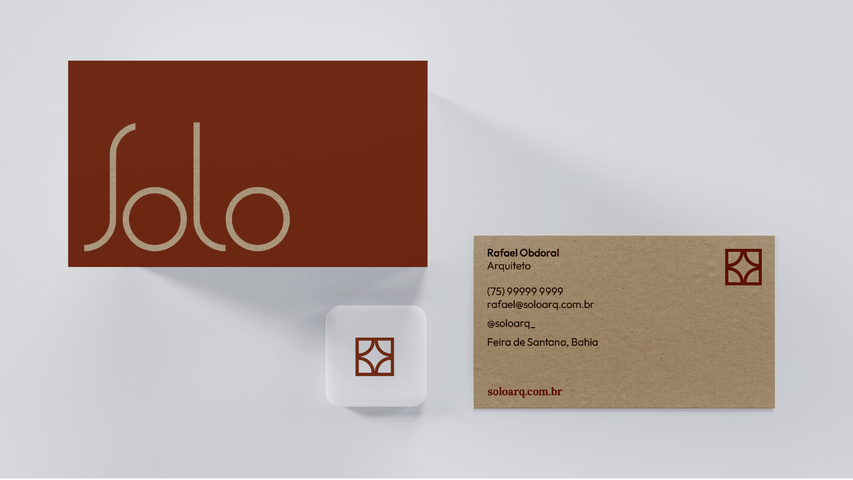
The system is inspired by geometry, continuous curves, and the modular logic of the Brazilian cobogó — a traditional architectural element designed to regulate light, airflow, and climate while creating rhythm and structure. Each element was designed to function independently while reinforcing the system as a whole.
The system is inspired by geometry, continuous curves, and the modular logic of the Brazilian cobogó — a traditional architectural element designed to regulate light, airflow, and climate while creating rhythm and structure. Each element was designed to function independently while reinforcing the system as a whole.
Impact & Reflection
IMPACT
The final identity provides SOLO with a coherent, flexible brand system that supports daily architectural practice — from technical documents to digital presence.
The client described the result as “exactly what we wanted, even though we didn’t know how to articulate it.”
REFLECTION
This project reinforced the importance of treating brand identity as a system rather than a visual style.
By grounding design decisions in structure, context, and usability, the brand becomes a practical tool — not an ornament — supporting both communication and architectural practice over time.
Impact &
Reflection
IMPACT
The final identity provides SOLO with a coherent, flexible brand system that supports daily architectural practice — from technical documents to digital presence.
The client described the result as “exactly what we wanted, even though we didn’t know how to articulate it.”
REFLECTION
This project reinforced the importance of treating brand identity as a system rather than a visual style.
By grounding design decisions in structure, context, and usability, the brand becomes a practical tool — not an ornament — supporting both communication and architectural practice over time.
Impact & Reflection
IMPACT
The final identity provides SOLO with a coherent, flexible brand system that supports daily architectural practice — from technical documents to digital presence.
The client described the result as “exactly what we wanted, even though we didn’t know how to articulate it.”
REFLECTION
This project reinforced the importance of treating brand identity as a system rather than a visual style.
By grounding design decisions in structure, context, and usability, the brand becomes a practical tool — not an ornament — supporting both communication and architectural practice over time.